Masonry view
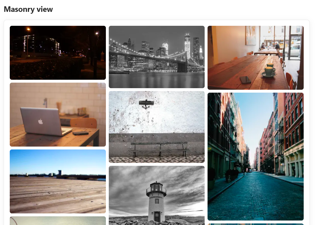
A Pinterest-style layout: columns of equal width, with each image at its natural height and nothing cropped. Images fill the columns in reading order, left to right, each going into whichever column is currently shortest, so there are no gaps under short images.
```obs-gallery
sources:
  - type: local
    path: Projects/WebDev
    recursive: true
view:
  type: masonry
```
grid is the same viewBefore version 2.5.0 this view was called grid. Existing blocks with type: grid keep working and render as masonry. New blocks should use type: masonry.
The number of columns follows the width of the note. For immich, immich-share and nextcloud sources the plugin fetches thumbnails rather than full-size images.
Pagination
For large collections, enable pagination to show a fixed number of images per page with Prev/Next controls instead of lazy-loading everything into one long scroll. This is especially useful when the gallery sits in the middle of a note and you don't want it to push the rest of the text far down the page.
```obs-gallery
sources:
  - type: local
    path: Photos/AllTrips
view:
  type: masonry
  pagination: true
  itemsPerPage: 24
```
Pagination can also be turned on by default for every gallery via Settings → Gallery View → Pagination; the per-gallery pagination/itemsPerPage keys shown above override that default. The same keys work in every view.
Customizing with CSS
The column width and spacing are CSS variables, so a CSS snippet can change them:
.gallery-masonry-layout {
  --gallery-masonry-column-width: 300px; /* minimum column width (default 220px) */
  --gallery-masonry-gap: 12px;           /* space between images (default 8px) */
}